This week’s Game Day is an SSL & ESL adaptation from our new ebook…
ESL Games for 21st Century Brains:
40 ESL Classroom Games to Teach English thru STEM + Art
Students will…
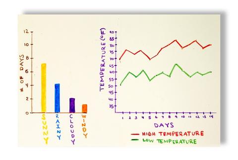
Create an infographic (bar graph) from statistical data of a weekly or 10-day weather forecast.
For sample infographics and some tips on how-to create graphs for your class visit www.sube.com/pages/esl-games.
21st Century Skills:
Infographics, information literacy, media and technology skills.
Modalities:
Interpersonal, Intrapersonal, Logical-Mathematic, Verbal-Linguistic, and Spatial
Bloom’s Taxonomy:
Knowledge, Comprehension, Application, Analysis
Grouping:
Individual
Materials:
- Graph paper, pencils, and markers.
- Printed samples of bar graphs, pie charts, infographics, and data tables.
- Week or 10-day weather forecast.
Activity:
- Allow students to gather data from weather.com or any other weather website for the next week or 10 days.
- For younger students or if your students don’t have individual Internet access, simply print up and distribute a paper version of the forecast or display it on the board or overhead projector.
- Using the target language, briefly identify the various kinds of infographics you’ve collected as samples on a handout or through a projector. For example, you might want to cover bar graphs, line graphs, data tables, pie charts, etc.
- As you define and explain each kind of visual, write out support vocabulary and phrases on the board or Word Wall.
- Ask students to then analyze their weather data and using graph paper to create a vertical bar graph illustrating the probability of sunshine, rain, clouds, or snow for each of next few days.
- Instruct more advanced students to simply color and label the graph so that it communicates all the data effectively.
- For younger students, offer the following tips:
Draw the graph itself first and title it. Get creative with the title: Holiday Forecast or My Thanksgiving Weather Report.
Label the X-axes (the horizontal or “left to right” side) “Days of the Week ” and the Y-axes (the vertical or “top to bottom” side) “Chance of Weather.”
Use different colors to represent different types of weather: yellow bars for sunny weather, blue bars for rainy weather, gray bars for cloudy weather, and red bars for snowy weather.
Each day of the week should have 4 colored bars showing the relative percentages of each type of weather.
Make sure each graph has a legend or key that explains the different colors.
For the bar graph itself, the top of the Y-axis should symbolize a 100% chance and the bottom, 0% chance. - After completing, students then present their weather graphs to the class to see how well they have communicated the data (i.e., how easy it is to understand, interpret, and use them).
- In the target language, discuss how to interpret and use the graph by asking questions. For example:
Which day will you need an umbrella?
Which day could you build a snowman?
Which day will you need sunglasses?
What will be the hottest day of the week?
What will be the coldest?
Tech Tools
Chart Maker App (iPad): This is an example of a free chart-making app. There are hundreds to choose from. Giving your students the assignment to find, use, evaluate, and review apps is a great 21st century skill builder. Ask them to find an app they like and create a chart, diagram, infographic, etc. to present to the class.